数日前の感染Simと再び戯れる.少しAgent(人間に相当)移動の部分にバグがあり,それを修正.それと感染からリカバーするのを確率でごまかしてい たのを,きちんと感染してからの日数(この例では14ステップ)後に免疫獲得(つまり治癒)の形に改めた.まだ左の最初の列と上の最初の行の,移動のルー チンが治っていない(これこの部分の周期境界条件の設定がやっかい)ので,ここだけAgentが固定されている.あと格子の数を150x150に少し増や した.他のパラメータは数日前と同じ.
The expected increase/decrease in the SIR model is obtained. However,
when I look at the graph of the actual number of infected people of my
acquaintance on FB, I see that the number of infected people has been
decreasing in a nice exponential function since late August. However, my calculations do not reproduce this exponential decay (the right graph on the logarithmic axis shows poor linearity).
My next goal is to set a larger grid and number of days (number of steps), and include post-healing and post-vaccination immunity expiration conditions, as well as the effect of vaccine evaders, to see if a periodicity of infection emerges, but I am not sure when this will be done. Well, I think I can't stop this programming, where a mysterious world opens up before my eyes with just the code I write.
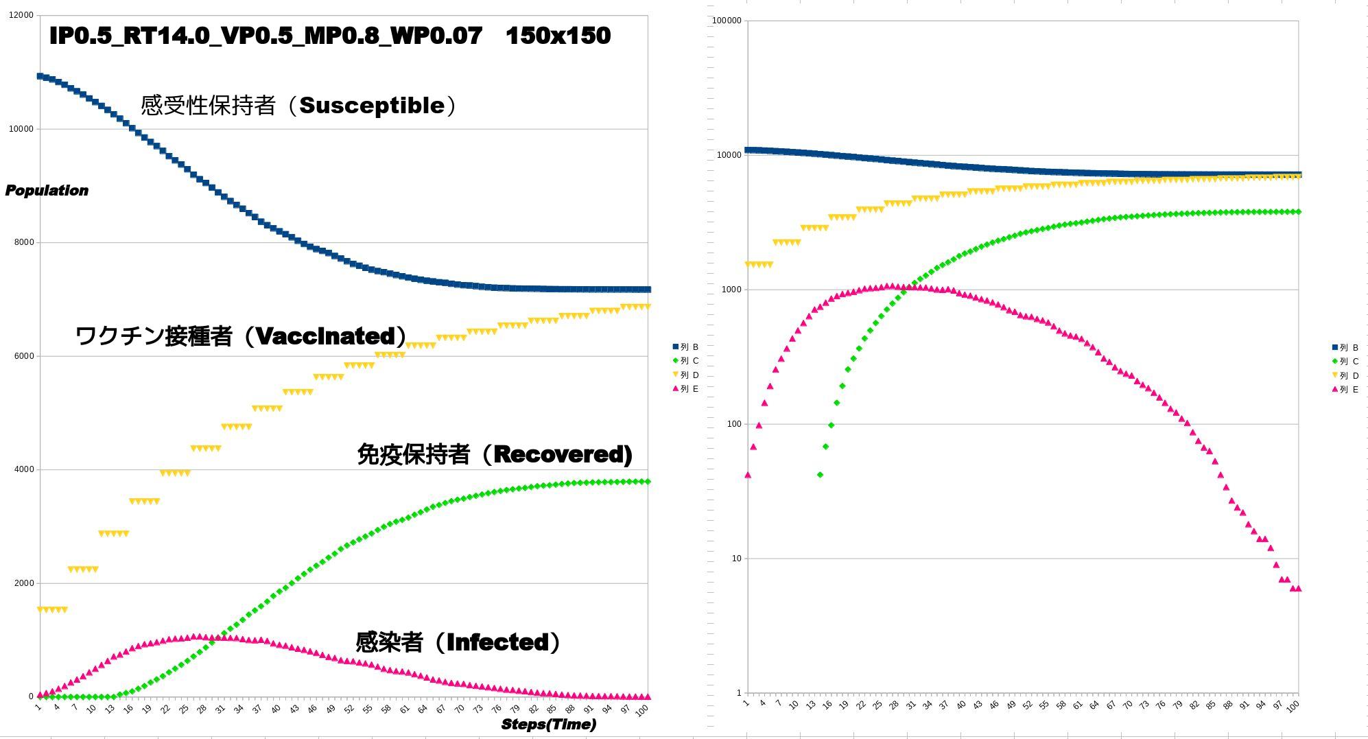
計算のパラメータは数日前(下記2021年10月12日計算)と同じ
接 触による感染確率IPが0.5.リカバリーする日数RTが14ステップ(日),空隙率VPが0.5,移動の激しさMPが0.8(全体の8割が移動する). さらにワクチンの5日ごとの接種者数の増加を全体の0.07増しとした.ワクチン接種数のみ5日間ごとに増加するものと簡略化.当然ながら新たなワクチン 接種者数は徐々に対象者(つまり未接種かつ未感染)が減るために減ってくる.右は縦軸を対数軸にしたもの.直線であれば,指数増加,指数減衰を示す.増加 と減少の最初と最後の部分は直線に乗るが,あとはあまり乗らない.時間ステップは一応100.これが100日に相当するのかどうかはわからない.右は標記 したようにSemi-Logプロット.
The parameters of the calculation are the same as a few days ago (calculated on October 12, 2021 below)
The probability of infection by contact IP is 0.5, the number of days to recover RT is 14 steps (days), the porosity VP is 0.5, and the intensity of movement MP is 0.8 (80% of the total movement). Furthermore, the number of vaccine recipients increased by 0.07 of the total number of vaccine recipients every 5 days. Only the number of vaccinations was simplified as increasing every 5 days. Naturally, the number of new vaccinees decreases as the number of eligible persons (i.e., unvaccinated and uninfected) gradually decreases. The right panel shows the logarithm of the vertical axis. A straight line indicates an exponential increase and an exponential decay. The first and last parts of the increase and decrease ride on a straight line, but the rest does not. The time step is 100, but it is not clear if this corresponds to 100 days or not. The right panel is a Semi-Log plot as mentioned.
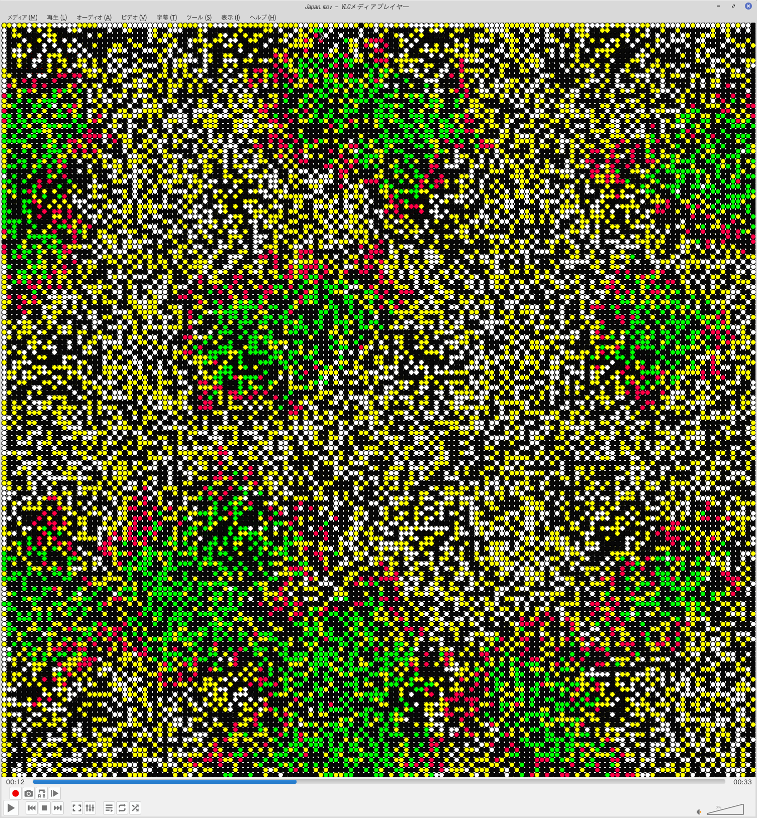
The results of the calculations are shown in a video (click on the image to go to the video on my YouTube page). First, 20 initially infected persons are randomly placed. From there, infection (red) begins to spread through human contact. However, the number of infected individuals gradually decreases due to recovery from infection (green) and vaccination of uninfected individuals (yellow), and the spread of infection is gradually suppressed. However, a certain number of people remain unvaccinated until the end.
COVID-19の今回の流行の急速な感染とその後の急速な収束?の過程を再現しようと,昨年試作した拙作のシミュレーションと朝から戯れています.変更 したところは,感染レートを上げた(デルタ株に対応),人流の勢いを増やした(この夏からの状態),ワクチン効果を新たに導入.の3点です.とくにワクチ ンは時間が経つと接種者が増えるようなパラメータ設定しています.ただしワクチン接種は非感染者に限定して,感染からリカバリした人にはワクチンは打って いない設定としました(免疫の効果は100%で同じと仮定).動画とグラフをごらんください.とても単純なルールによるシミュレーションですが,結構いい 線言っているのではと,自分では思っています.ただ感染者数の数は,とても多い設定で,日本よりはおそらく,インドなどの例に近いかと.むしろインドなど で収束している原因の説明と言ったほうがよいかも知れません.ただしインドのワクチン接種率はもっと低いのですが.そのあたりのパラメータ設定はこれから です.とりあえずプロトタイプを上げます.計算手法の解説は以下です.
I have been playing with my simulation prototype I made last year since this morning, trying to reproduce the process of the rapid infection and subsequent rapid convergence of the COVID-19 epidemic. I have made three changes: I have increased the infection rate (corresponding to the delta strain), I have increased the momentum of the human flow (as it has been since this summer), and I have introduced a new vaccine effect. The vaccine effect was newly introduced. In particular, the parameters of the vaccine have been set so that the number of vaccinations will increase as time goes by. However, vaccination is limited to non-infected persons, and those who have recovered from infection are not vaccinated (assuming that the effect of immunity is the same at 100%). Please see the movie and the graph. This simulation is based on a very simple rule, but I think it is doing a pretty good job. However, the number of infected persons is very large. It may be better to say that this is an explanation for the convergence in India and other countries rather than Japan. However, the vaccination rate in India is much lower. The parameter settings for this are still to be worked out. For now, a prototype is shown below. The calculation method is as follows.
http://seagull.stars.ne.jp/Simul.../COVID-19/COVID-19_1.html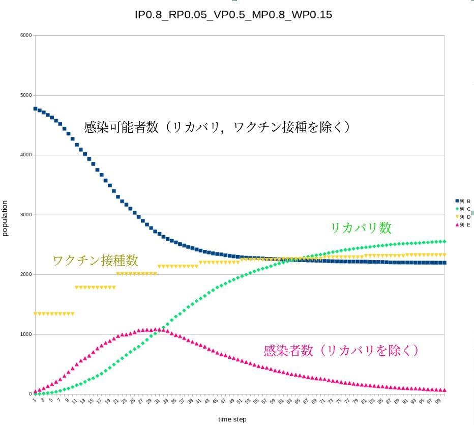
計 算100ステップ後までの経過.IPが感染確率(エージェントが接触して感染する確率,これデルタ株用にとても高いレートにしました),RPはリカバリす る確率.かなりゆっくり目です.VPは空隙(人のいない場所)の確率,まあ密の具合といったところです.MPがムービングレート,つまり人流の強弱です が,かなり高くしています.WPがワクチン接種する確率で,10ステップごとに上げていますが,グラフが頭打ちになるのは,感染可能者にしか接種していな い想定で,その人の数がどんどん減っていくからです.初期値は人口の30%がワクチン接種終了からスタートしてます(夏前の状態ってこんなでしたか?).
IP is the probability of infection (probability of infection by agent contact, which I set very high for delta stock), RP is the probability of recovery, which is quite slow, VP is the probability of voids (unoccupied areas), which I set very high, MP is the moving rate, which is the strength of the human flow, I set very high. WP is the probability of vaccination, which is increased every 10 steps, but the graph is not very large because it is assumed that only those who can be infected are vaccinated, and the probability of recovery is very low. The reason why the graph is capped is that it assumes that only those who can be infected are vaccinated, and the number of such people is decreasing rapidly. The initial value starts with 30% of the population having been vaccinated (was this the situation before the summer?). The following is a video of the simulation.
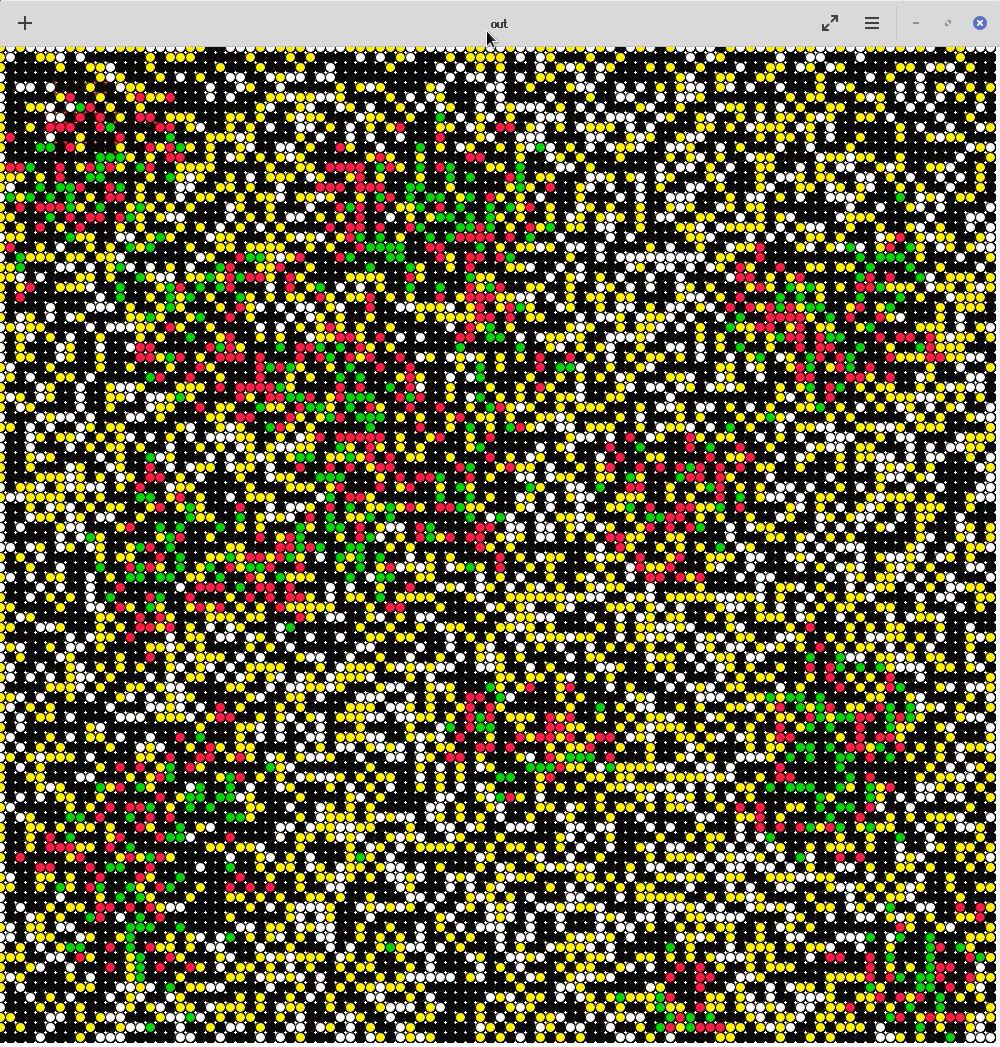
シミュレーションの動画です.色はグラフと同じで,白が感染する可能性のある人,黄色がワクチン接種ずみ.黒は空隙,赤が感染者,緑が感染からリカバリした人です.最初急激に感染が拡大する様子がわかります.
The above is a video of the simulation. The colors are the same as in the graph: white is the potentially infected population, yellow is the vaccinated population, black is the void, and red is the infected population. Black is a void, red is an infected person, and green is a person who has recovered from infection. You can see the rapid spread of infection at the beginning.
Copyright © 2024 Yoshio Okamoto All Rights Reserved.